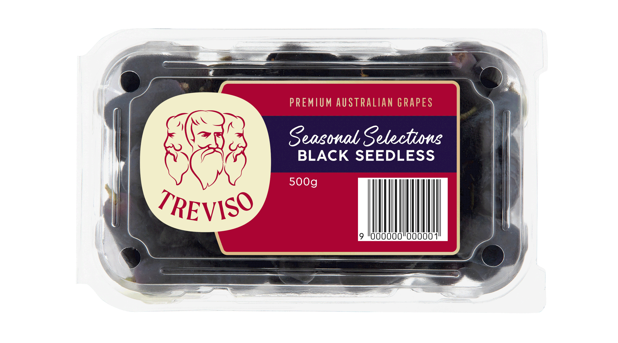
New Treviso logo & packaging
Last year, Fresh Produce Group had an opportunity to enter the domestic market with Treviso table grapes in punnets moving away from a purely wholesale model. To build brand recognition, the logo was simplified, so the three heads were more distinguishable on a consumer label format.
After a successful season in all the domestic retailers, the label design was reviewed and it felt it wasn’t communicating the brand's premium position. For consumers to show interest in Treviso grapes as a premium product, the design must provide quality cues that validate the price.
Working with Fresh Produce Group, AKA were given the opportunity to refresh the label to dial up cues that translate in the shopper's mind to communicate Treviso is a premium brand. Print finishes also played an intrinsic part in helping deliver these quality cues.